


ONDE VOCÊ QUER ESTAR?
Conheça nossa coleção

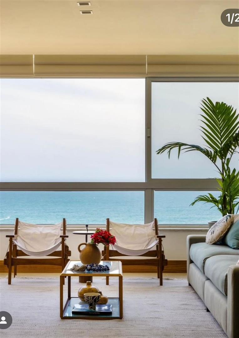
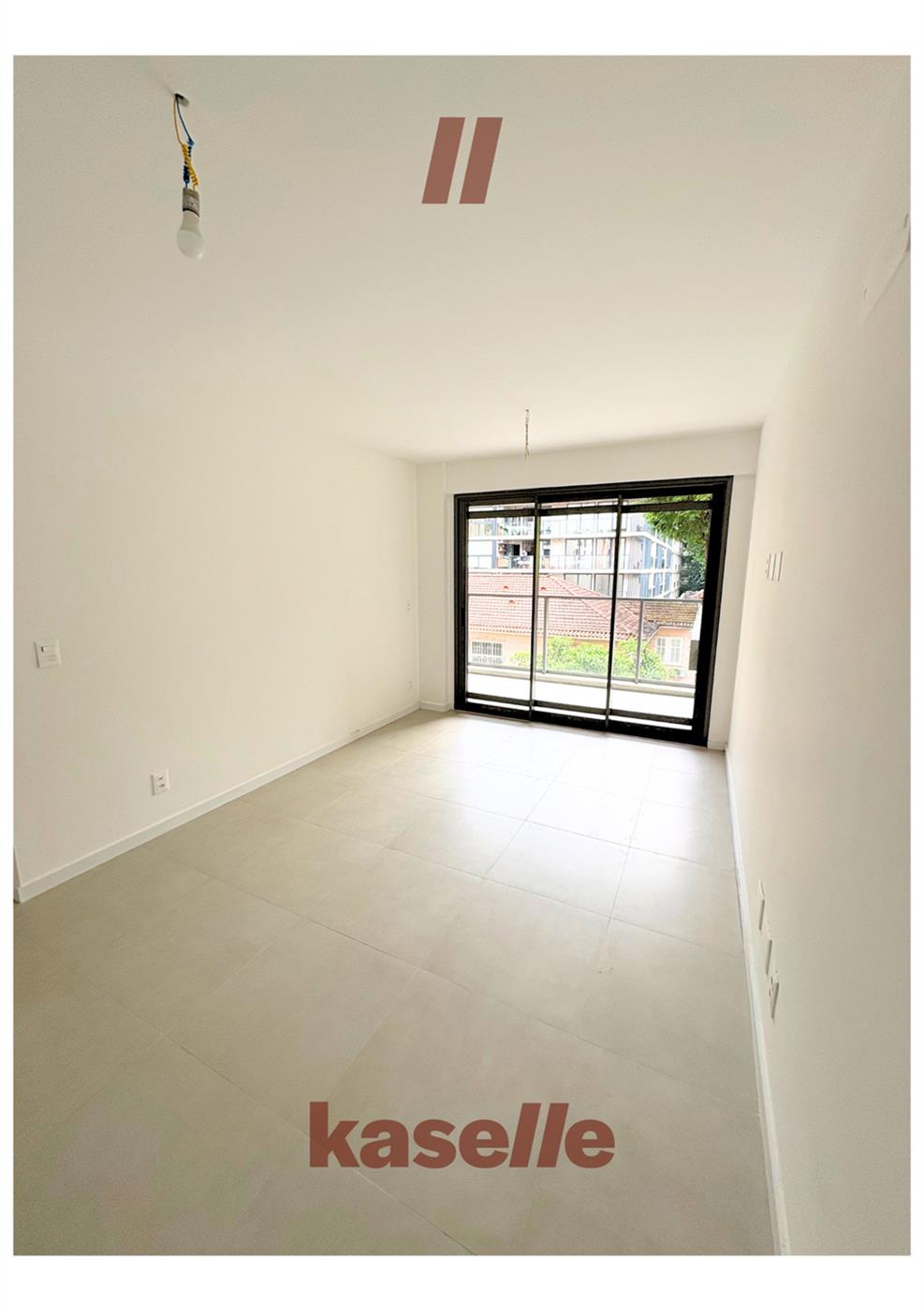
RARO
Mais que uma imobiliária.
Somos uma convicção.
Em um mercado que acumula, escolhemos selecionar. Cada residência em nossa coleção foi pessoalmente visitada e criteriosamente avaliada. Nossa curadoria é feita por um único critério: ser extraordinária.
O que não nos emociona, não apresentamos.
Raro
Mais que uma imobiliária.
Somos uma convicção.
Em um mercado que acumula, escolhemos selecionar. Cada residência em nossa coleção foi pessoalmente visitada e criteriosamente avaliada.
Nossa curadoria é feita por um único critério: ser extraordinária. O que não nos emociona, não apresentamos.


O QUE FAZEMOS E COMO FAZEMOS
NOSSOS SERVIÇOS


O que fazemos e como fazemos
NOSSOS SERVIÇOS
O LAR CERTO NÃO SE ENCONTRA. SE RECONHECE.
O que você procura talvez
ainda não exista no mercado.
Para quem busca algo além do que está publicamente disponível, oferecemos um serviço de consultoria privada.
Acessamos oportunidades off-market, vendedores discretos e parcerias exclusivas - com total confidencialidade.
Começamos com uma conversa, não com uma busca. Compreendemos como você vive antes de sugerir onde você pode viver.


A arte de entregar o inimaginável.
Mais que uma imobiliária. Uma anfitriã de experiências.